Das Startfenster von IDL Konsis lässt sich in die nachfolgend dargestellten Bereiche gliedern:
In IDL Konsis kann man auf zwei Wegen zu den Menüs navigieren:
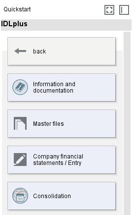
Beim Start des Programms und in jedem neuen, leeren Register, werden die verfügbaren Menüs angezeigt. Diese sind thematisch in sogenannte Hauptknoten gegliedert. Die Ansicht kann mit Hilfe der Maustaste nach links oder rechts verschoben werden. Über das Symbol "Mehrfach- bzw. Einfachanzeige" kann die Anzeige dahingehend verändert werden, dass entweder alle Themen oder immer nur das ausgewählte Thema angezeigt wird.
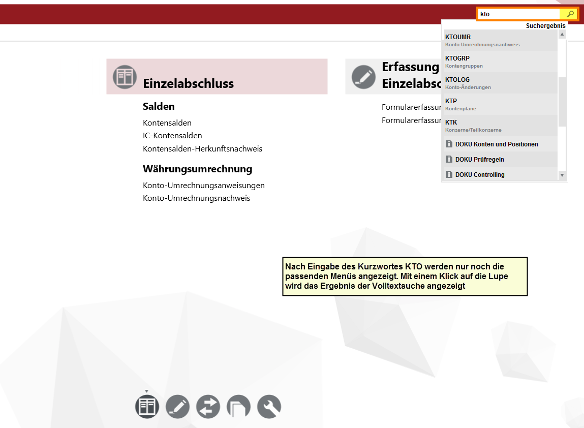
Der Aufruf der Anwendung erfolgt durch einfachen Mausklick auf den jeweiligen Eintrag. Links davon wird in hellgrauer Schrift das Kurzwort der geählten Anwendung eingeblendet.
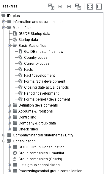
Im Ressourcenbaum befinden sich auch viele Anwendungsdokumentationen. Über das Symbol "Dokumentationen und Hilfetexte anzeigen" in der globalen Werkzeugleiste erfolgt der Wechsel von der Anwendungsanzeige in die Dokumentationsanzeige.
Nach der Eingabe eines Kurzwortes in die Kurzwortzeile werden im Ressourcenbaum nur noch die Menüs angezeigt, die zu der Eingabe passen. Wenn das Kurzwort nicht bekannt ist, können auch Begriffe wie z.B. "Konten" oder "Währung" angegeben werden, es werden dann alle Menüs angezeigt, die den eingegebenen Begriff enthalten. Mit Hilfe des Suchensymbols startet man die Volltextsuche, d.h. jetzt werden nicht nur die Menübezeichnungen sondern z.B. auch Dokumentationen nach dem Begriff durchsucht und angezeigt. Auch Tippfehler werden korrigiert, so dass auch die Eingabe von "Knoten" zum Aufruf der Anwendung "KTO = Konten" führt.
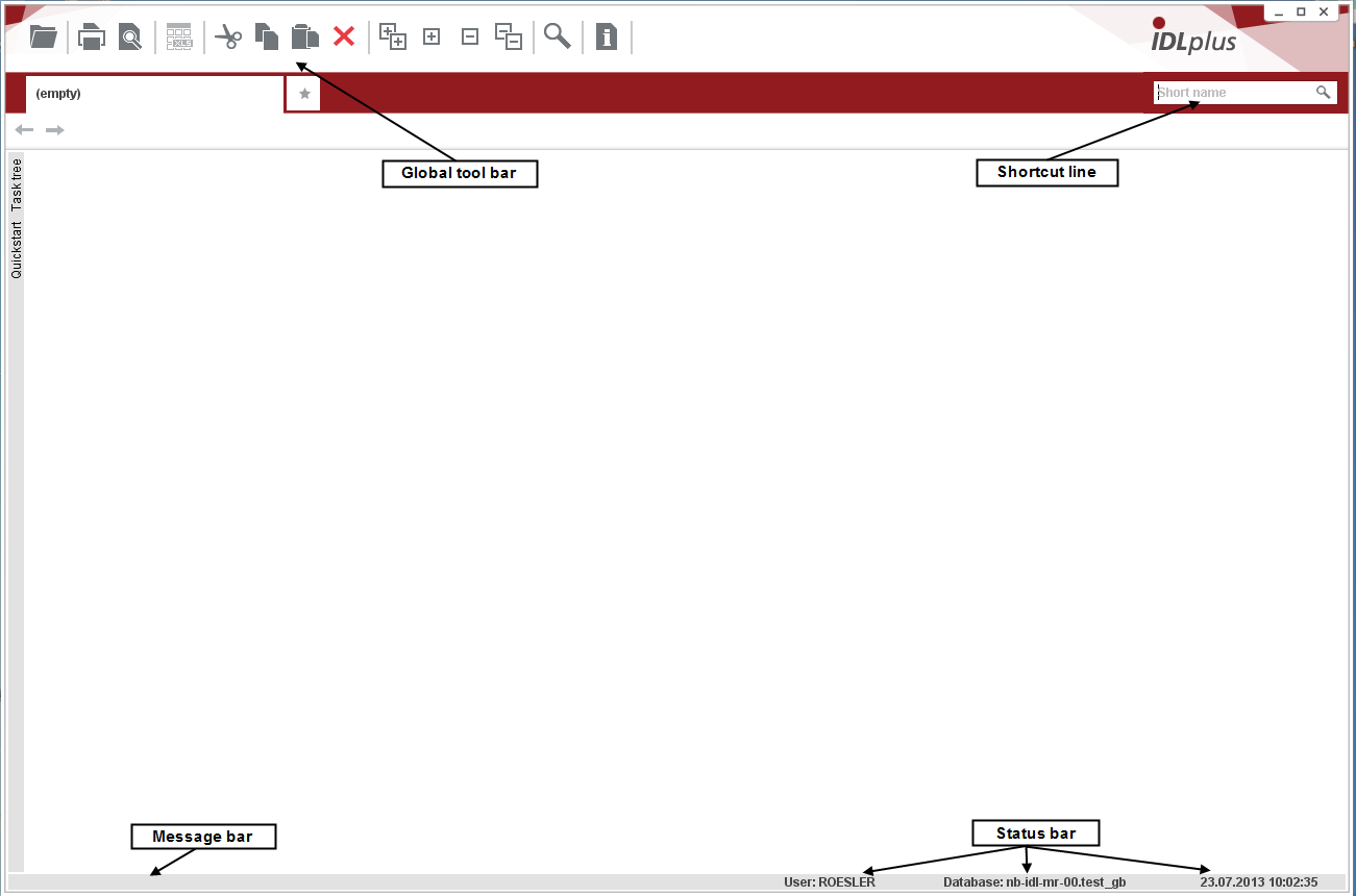
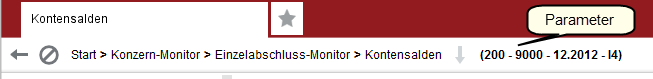
Die Navigationsleiste zeigt immer an, über welchen Aufruf / welche Menüs man in die aktuelle Anwendung gelangt ist. Ebenso werden (in Klammern dargestellt) die wichtigsten Parameter aus dem Selektionsbereich angezeigt. Ein Mausklick auf "Start" schließt die aktuelle Anwendung inkl. aller zuvor gestarteten Anwendungen und kehrt zum Ressourcenbaum zurück. Um in die vorige Anwendung zu gelangen, klicken Sie auf den Pfeil, der nach links zeigt. Oder klicken Sie einfach auf die Anwendung, zu der Sie zurückkehren möchten.
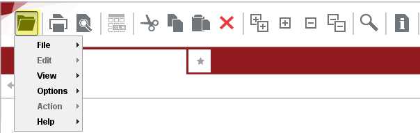
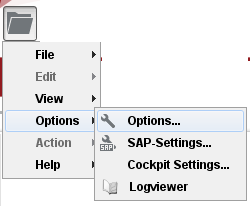
Hinter dem Symbol "Einstellungen" in der globalen Symbolleiste verbergen sich einige Möglichkeiten, individuelle Einstellungen sowohl hinsichtlich der Darstellung als auch einiger Funktionen zu treffen.
Im Menüpunkt "Ansicht" befinden sich Optionen zum Ein- und Ausblenden von: Statuszeile, Symbolleiste, leeren Spalten und Nullspalten sowie Änderungsinformationen (Änderungs-User, -Datum und -Zeit) und die Info zu vorhandenen Hilfetexten.
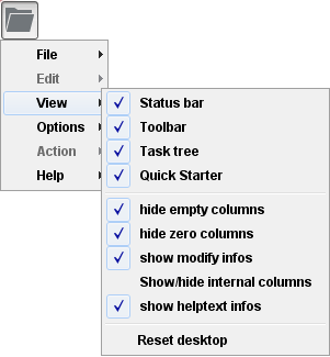
Mit der Option "Oberfläche zurücksetzen" können alle zuvor verschobenen Bereiche auf einmal an ihre ursprüngliche Position verschoben werden.
Die Option "Interne Infospalten anzeigen" ist standardmäßig nicht aktiviert, eine Aktivierung wird durch Beenden des Programmes wieder zurückgenommen. Wird sie aktiviert, werden in einigen Übersichten zusätzliche Spalten angezeigt, die i.W. zur Ermittlung der Ursachen im Fehlerfall durch die IDL-Hotline dienen.
Unter "Optionen" hat der Anwender vielfältige Möglichkeiten, das System individuell einzustellen:
Anmerkung:
Geänderte Optionen werden erst nach nochmaligem Aufrufen der Anwendung und teilweise erst nach erneutem Öffnen von IDL Konsis aktiviert.
[Darstellung]:
Im Reiter "Darstellung" gibt es einige Optionen, mit denen Sie Ihr IDL Konsis verändert darstellen können. Nachfolgend wollen wir Ihnen diese Optionen erläutern oder anhand von Beispielen darstellen. Am besten können Sie diese Optionen jedoch kennen lernen, wenn Sie sie ausprobieren und einige Zeit damit arbeiten. Alle Optionen lassen sich beliebig aktivieren und deaktivieren. Auf diese Weise können Sie mit der Zeit die Darstellungsvarianten herausfinden, mit denen Sie am besten arbeiten können.
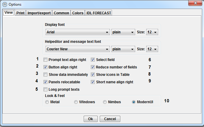
Neben der Schriftart und -größe für die Anzeige und für Hilfetexte können folgende Einstellungen geändert werden:
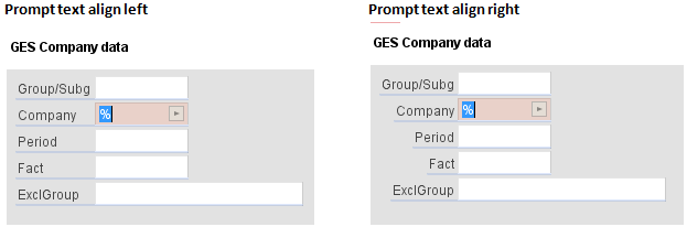
1) Prompttexte rechtsbündig: Die Ausrichtung der Prompttexte neben dem Eingabefeld kann rechts- oder linksbündig eingestellt werden
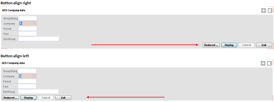
2) Buttons rechtsbündig: Bei Demarkierung erzielen Sie eine linksbündige Darstellung der Buttons und dadurch eine linksbündige Ausrichtung des gesamten Bereichs im Fenster.
3) Daten sofort anzeigen: Bei Aktivierung dieser Funktion werden die Daten lt. Vorbelegung sofort angezeigt, ohne den Button <Anzeigen> zu betätigen. In neueren Anwendungen ohne Selektionsbereich werden die vorhandenen Daten unabhängig von der Einstellung immer sofort angezeigt.
4) Arbeitsflächen verschiebbar: Ist hier der Haken gesetzt, können einzelne Anwendungsbereiche (Selektionsbereich, Übersichtstabelle, Einzelsatzbereich etc.) mit der Maus per "Drag & Drop" an den Rand verschoben werden, so dass mehr Platz für andere Anwendungsbereiche zur Verfügung steht. Hat man den Anwendungsbereich mit der Maus "gepackt", zeigt eine rote Umrandung an, an welche Stellen dieser sinnvoll verschoben werden kann. Mit der umgekehrten Mausbewegung werden die verschobenen Bereiche wieder zurückgeholt.
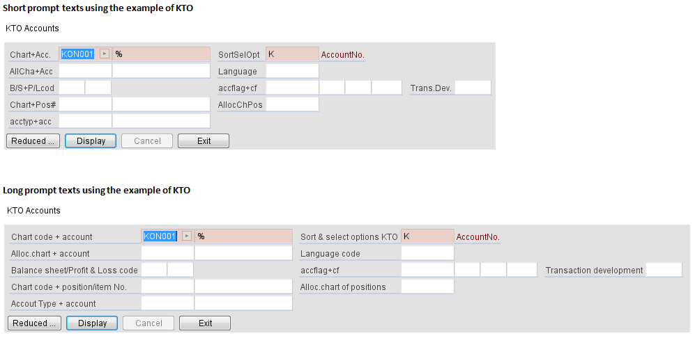
5) Lange Feldbezeichnungen: Bei Selektion dieser Option werden sämtliche Feldtexte in den Masken (Selektionsbereich, Einzelsatzbereich etc.) mit den Langtexten angezeigt, die man sonst nur als Tooltip beim Verweilen mit dem Mauszeiger auf dem Feldtext sieht, sofern dieser Text nicht länger als 35 Stellen ist. Die Masken werden dadurch natürlich erheblich breiter. Daher wird diese Option nur Anwendern mit größeren Bildschirmen empfohlen.
6) Anwendungen automatisch in neuer Registerkarte öffnen: Ist diese Option aktiviert, wird bei jedem Aufruf einer Anwendung über das Kurzwort automatisch eine neue Registerkarte geöffnet. Ist die Option nicht aktiviert, müsste man zunächst eine neue Registerkarte öffnen und die Anwendung dann dort aufrufen.
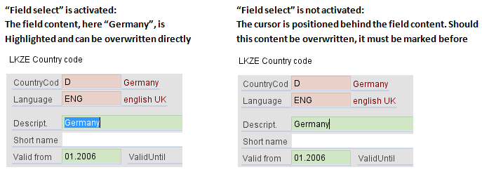
7) Feld selektieren: Wird diese Funktion aktiviert, wird der Inhalt gefüllter Zellen im Anwendungskopf einer Anwendung beim Selektieren mit der Maustaste oder Tabtaste markiert.
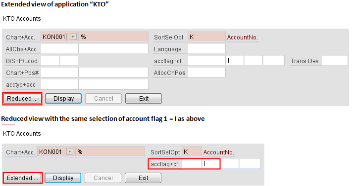
8) Feldanzahl reduzieren: Über die Aktions-Button <Erweitert> bzw. <Reduziert> besteht die Möglichkeit einer Minimalanzeige des Bildschirmkopfes. Ist der Haken gesetzt, wird der Selektionsbereich immer zunächst auf ein Minimum reduziert. Dieser kann bei Bedarf mit dem Aktionsbutton <Erweitert> erweitert werden. Ist der Haken nicht gesetzt, wird immer sofort die erweiterte Ansicht gezeigt, die Aktionsbuttons <Erweitert> bzw. <Reduziert> entfallen dann. Sobald ein Feld im Anwendungskopf gefüllt ist, wird dieses nicht ausgeblendet.
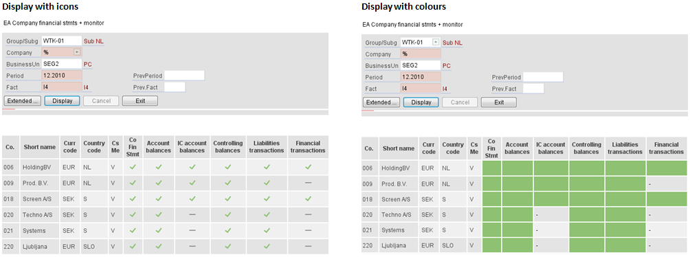
9) Icons statt Farben in der Tabelle: siehe unterschiedliche Darstellung unten
10) Kurzwort rechtsbündig: Standardmäßig wird das Eingabefeld für das Kurzwort rechts angezeigt. Entfernen Sie hier den Haken, wird es links neben der globalen Symbolleiste angezeigt.
11) Speicherbelegung: Bei Aktivierung dieser Funktion wird in der Statusleiste angezeigt, wieviel Speicher aktuell von der Anwendung belegt ist und wieviel ihr zugewiesen ist.
[Druck]
Im Reiter "Druck" können Optionen bezüglich des Druckes eingestellt werden.
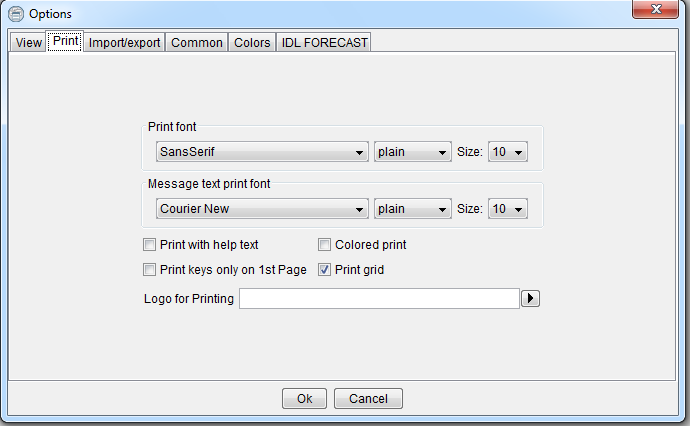
Zusätzlich können Sie an dieser Stelle Ihr Firmenlogo in einem der Standardbildformate .png, .jpg oder .gif hinterlegen, es erscheint dann auf allen Ausdrucken.
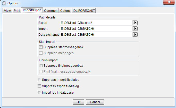
[Import/Export]
In IDL Konsis haben Sie die Möglichkeit, Daten über verschiedene Dateiformate in das System zu importieren bzw. aus dem System zu exportieren.
In den "Import- / Export-Optionen" hinterlegen Sie, in welchen Dateiordnern die erstellten Export-Dateien abgelegt bzw. Import-Dateien abgeholt werden sollen. Standardmäßig sind dies die Ordner "Export" und "Batch" auf Ihrem lokalen Laufwerk.
Wird zusätzlich mit dem Konzern- / Teilkonzerndatenaustausch gearbeitet, kann auch hierfür ein separater Ordner angegeben werden.
Zusätzlich können Sie folgende Optionen wählen:
Mehr zu den vielfältigen Möglichkeiten des Datenimports, insbesondere zur Einrichtung von kundenindividuellen Importformaten, finden Sie in den Anwendungshilfen (F2) in den jeweiligen Importmenüs.
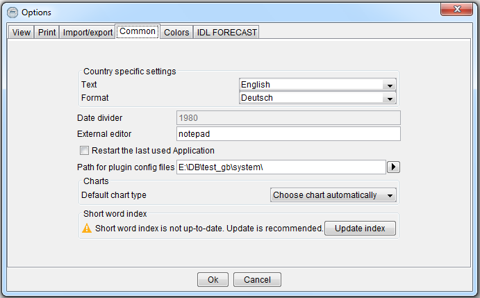
[Allgemein]
Im Reiter "Allgemein" können Sie, soweit lizenziert, die Oberflächensprache und dazu passend die Zahlenformate ändern. Ebenso können Sie hier festlegen, ob bei erneutem Öffnen von IDL Konsis die zuletzt verwendete Anwendung geöffnet werden soll.
Kunden, die Ihre Tabelleninhalte häufig in Diagrammen anzeigen lassen, können hier ein Standarddiagramm-Typ hinterlegen. Wurde beim erstmaligen Start der Aufbau des Index für die Kurzwortsuche abgebrochen, kann dieser über die Aktion "Index aktualisieren" neu aufgebaut werden.
[Farben]
Im Reiter [Farben] können individuelle Farbeinstellungen für Reports vorgenommen werden. Eine Veränderung der Farben im Programm selbst ist nicht möglich.
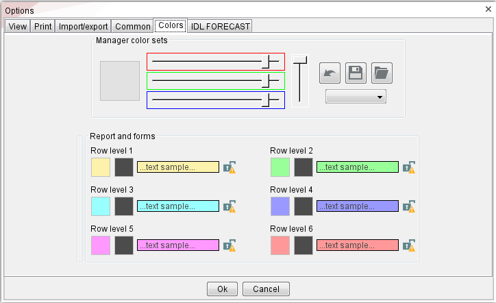
Mit den drei Schiebereglern für die Farben rot, grün und blau lassen sich alle angezeigten Elemente auf einmal verändern. Dies Zusammenwirken sorgt für insgesamt "harmonische Farben". Sollen einzelne Elemente von dieser harmonischen Farbsetzung ausgenommen werden, können sie gegen Veränderungen gesperrt werden. Dazu dient das Vorhängeschloss-Symbol rechts neben dem Element.
Rechts neben den Reglern gibt es ein Symbol zum Zurücksetzen, welches die Farben auf den letzten gespeicherten Zustand zurücksetzt. Des weiteren können über das Diskettensymbol Farbsets gespeichert und gespeicherte Sets über das Ordnersymbol geladen werden. Die Farbsets werden in einem eigenen Format (icos = "IDL Color Set") abgespeichert. Auf diese Weise können Farbeinstellungen von einem Benutzer zum anderen übertragen werden.
Die Auswahlbox unter diesen drei Symbolen stellt einige voreingestellte Farbzusammenstellungen zur Verfügung. Wird eine dieser Zusammenstellungen gewählt, passen sich alle Farben und Regler automatisch an. Wird eine Farbe geändert oder ein Regler verschoben, ist die Auswahlbox sofort wieder leer.
Wird die harmonische Farbeinstellung nicht gewünscht, können die Farbein auch einzeln eingestellt werden. Hierzu öffnet sich beim Anklicken einer Farb-Box ein Farbdialog wie in MS Excel, der Farben zur Auswahl anbietet. Über die Schaltfläche <mehr> öffnet sich ein Farbdialog, der die Farbauswahl in verschiedenen Varianten (Farbpalette, Schieberegler oder nummerische Eingabe) unterstützt.
Neben dem Symbol für die ivdividuellen Einstellungen (siehe Kapitel 2) befinden sich folgende Symbole in der globalen Symbolleiste
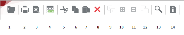
[1 Druckvorschau]: Auf jeder Seite des Programms können Sie einen Druck starten, wobei Sie beim Klicken auf das Druckersymbol zunächst in die Druckvorschau gelangen. Hier finden Sie Optionen zum Einrichten der Seite, die Funktion Drucken und den Export in eine PDF-Datei. Mit der Funktion "Vorschau Zoom" wird die Anzeige von Tabellen in der Druckvorschau verkleinert oder vergrößert, ohne dass dies Auswirkungen auf die folgende Druckausgabe hat. Die Funktion "Tabellen Zoom" verändert die Anzeige von Tabellen in der Druckausgabe. Diese Funktion kann nicht betätigt werden, wenn der Inhalt bereits durch "Fit to page" für den Druck optimiert wurde.
[2 Excelexport]: Markierte Tabelleninhalte können über diesen Button direkt in eine Excel-Datei exportiert werden. Nach dem Start der Funktion wird ein Dateidialog zur Definition des Namens und des Speicherortes der Excel-Datei geöffnet. Die Tabelleninhalte werden automatisch in das erste Blatt der Excel-Datei eingefügt. Dabei werden die Formatierungen wie Schriftgrad, -schnitt sowie Schrift- und Hintergrundfarbe übernommen. Zusätzlich kann auch eine Baumstruktur, z.B. von Reports, übernommen werden. Hierzu ist es notwendig, dass die Baumstruktur vor dem Markieren der Zeilen aufgeklappt wird. Alternativ können sämtliche Bildschirminhalte auch per Copy/ Paste mit den üblichen Tastenkombinationen STRG+C und STRG+V nach Excel kopiert werden.
[3 Export]: Die markierten Zeilen oder der gesamte Tabelleninhalt werden in eine Textdatei exportiert. Der Anwender wird zu einem Dateidialog geführt, um die Datei abspeichern zu können.
[4 Aktion]: Das Aktionsmenü ändert sich von Anwendung zu Anwendung. Hierüber können Sie die angezeigten Datensätze bearbeiten, Verarbeitungen anstoßen oder in Folgeanwendungen verzweigen. Zusätzlich zu der globalen Menüleiste erreichen Sie das Aktionsmenü über die rechte Maustaste, so dass Sie einzelne Datensätze auswählen und bearbeiten können.
Bei Bedarf können u.a. Verarbeitungsmöglichkeiten über Benutzer-/ Benutzergruppen- Berechtigungen eingeschränkt werden z.B. auf nur Anzeige-, Export- oder Druckrechte für den oder die Wirtschaftsprüfer. Alle nicht zur Verfügung stehenden Aktionen sind nicht dargestellt (sind inaktiv geschaltet).
Zeilenaktionen sind immer erst aktiv, wenn eine Zeile selektiert wurde. Aktionen, die aufgrund der fehlenden Zeilenmarkierung nicht ausgeführt werden können, werden hellgrau hinterlegt.
[5 Hilfe]: Über das Fragezeichen können Sie hinterlegte Hilfetexte aufrufen, in der Infobox Informationen über das verwendete Datenbanksystem und die verwendete Version von IDL Konsis finden sowie Informationen zu den von Ihnen verwendeten Lizenzen aufrufen. Über die Option Quick Support gelangen Sie auf unsere Internetseite www.idl.eu, auf der Sie sich die Anwendung Teamviewer installieren können, für den Fall dass jemand vom Support auf Ihr System schauen möchte.
Aktionen, die für die jeweilige aufgerufene Anwendung eindeutig sind, werden in einer eigenen Symbolleiste in der Titelzeile der Tabelle angezeigt. Die jeweilige Funktion wird, wenn man mit dem Mauszeiger über dem Symbol verweilt, mit einem Tooltip erläutert.
Die Symbolleiste in der Tabelle beinhaltet alle allgemeinen Funktionen, die auf die gesamte Tabelle wirken, ohne dass ein Datensatz markiert werden muss
2. Erläuterung zur Suche:
Mit Hilfe der Suchfunktion können Sie in den Übersichtsanwendungen nach einzelnen Datensätzen suchen. Die gefundenen Sätze werden dann alle/teilweise selektiert und können wie gewünscht bearbeitet werden.
Beispiel: Suche nach allen Konten, die in der Kontenbezeichnung das Wort "Ford" = Forderungen enthalten. Geben Sie im Feld "Suchtext" den gewünschten Suchbegriff ein und gehen Sie auf "Suchen". Der Suchen-Dialog unterstützt auch die Sonderzeichen '%' und '_' wie in anderen Anwendungen.
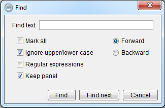
Sie können aber genauso auch nach bestimmten Kontonummern/Kontengruppen suchen. Durch das Dialogfeld [Alles markieren] werden Ihnen alle Datensätze in der Übersicht farblich markiert
Wählen Sie das Feld [Dialog offen lassen], wird Ihnen jeder gefundene Datensatz einzeln angezeigt/markiert. Mit dem Button [Weitersuchen] gelangen Sie dann zum nächsten gefundenen Datensatz, wobei Sie über die Auswahlbuttons rechts entscheiden können, in welche Richtung weitergesucht werden soll. Ist die Trefferliste vollständig, dann erfolgt die Ausführung der markierten Zeilen über den Menüpunkt <Aktion>. Hier können Sie dann die gewünschte Aktion auswählen (Beispielsweise Ändern, Löschen et.).
7./8. Aus dem Hauptfenster ablösen / auf Seitenablage verschieben
Einzelne Bereiche lassen sich individuell verschieben, an den Bildschirmrand versetzen oder auch vom aktuellen Fenster abkoppeln. Neben der Drag and Drop Funktion mit der Maus dienen hierzu zwei Schaltflächen, die in allen Teilbereichen zu finden sind:

Mit Symbol 1) kann man ein Fenster schließen und es wird an der Seite abgelegt.
Mit Symbol 2) können Fenster vom Desktop abgekoppelt und unabhängig auf dem Bildschirm positioniert werden. Dies ist insbesondere hilfreich, wenn ein Anwender mit mehreren Bildschirmen arbeitet, so dass z.B. eine längere Tabelle komplett auf einen Bildschirm ausgelagert wird. Ein einfacher Mausklick auf dieses Symbol koppelt das Fenster vom Desktop ab. Danach kann das Fenster frei positioniert und in der Größe angepasst werden. Das Symbol verwandelt sich dann in eine zusammengeklappte Raute. Ein Mausklick auf das verwandelte Symbol koppelt das Fenster wieder in den Desktop ein wie zuvor. Alle während der Auskoppelung erfolgenden Aktionen wie z.B. Neu-Selektionen, Wechsel der Registerkarte usw. wirken auch auf das ausgekoppelte Fenster.
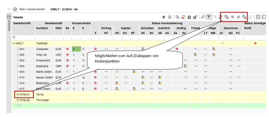
Einige Anwendungen haben noch zusätzliche Symbole, mit denen für die jeweilige Anwendung typische Funktionen ausgeführt werden können. Hier am Beispiel des Konzernkreismonitors (KTKGES):
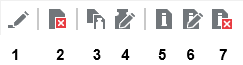
Funktionen, die für eine oder mehrere markierte Datensätze durchzuführen sind, lassen sich bequem über Symbole im Kontextmenüt (rechte Maustaste) erreichen. Hier können folgende Funktionen erreicht werden:
Die Funktionstasten Ihrer Tastatur haben in IDL Konsis folgende Funktionen:
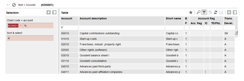
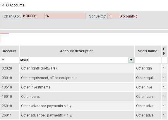
Eine spezielle Form von Anwendungen sind so genannte Übersichtsanwendungen (beispielsweise KTO). Die Übersichten dienen der Selektion und Analyse eines vorhandenen Datenbestandes. Außerdem können ausgehend von den Übersichtsschirmen bestimmte Verarbeitungen initiiert werden. Mit den Slidern rechts und unterhalb der Tabelle (blau markiert) kann die Ansicht zum gewünschten Ausschnitt verschoben werden. Unten rechts befindet sich ein Schieberegler (rot markiert), mit dessen Hilfe sich die Tabelle vergrößern (Regler nach rechts) bzw. verkleinern (Regler nach links) lässt. In der Tabelle dargestellte Symbole werden dabei mit vergrößert. Mit einem Klick in das Prozentzeichen können vorgegebene Prozentangaben (100%, 200%, 50% usw.) ausgewählt werden.
Eine Verarbeitung der Datensätze kann durch Selektion der einzelnen Datensätze erfolgen (wenn nur eine Teilmenge bearbeitet werden soll). Zur Bearbeitung der selektierten Menge klicken Sie auf die rechte Maustaste und wählen die gewünschte Aktion aus der Symbolleiste (Daten bearbeiten, Daten löschen, Mengen-Kopieren, Mengen-Ändern). Überall dort, wo die Verzweigung in eine mit der betreffenden Anwendung zusammenhängenden Anwendung sinnvoll erscheint, können auch diese über Folgeverarbeitungen aufgerufen werden, ohne ins Menü zur Auswahl der Anwendung verzweigen zu müssen (Bsp.: aus der Anwendung KTO = Kontenstamm kann direkt über Folgeverarbeitung die Applikation POSKTO = Position+Konten-Zuordnungen angesteuert werden).
Die genaue Bezeichnung der in den Übersichtstabellen verkürzt dargestellten Überschriften lässt sich mit der so genannten "Tooltip-Funktion" anzeigen, wenn man mit dem Mauszeiger auf der entsprechenden Zelle verweilt.
Im Selektionsbereich auf der linken Seite befinden sich die Eingabe- und Anzeigefelder, die zur Selektion der gewünschten Datenmenge genutzt werden können. Dieser Selektionsbereich kann über die oben rechts angezeigten Kästchen aktualisiert (Pfeilsymbole), vom Hauptfenster abgelöst (Kästchen mit 4 Ecken) sowie ausgeblendet (Kästchen mit einem Rand) werden. Über das Dreieck-Symbol unten rechts kann der Selektionsbereich reduziert oder erweitert angezeigt werden. Bei den farbig hinterlegten Feldern handelt es sich um Key- oder Schlüsselfelder, die zwingend gefüllt werden müssen. Zulässig ist dort ein gültiger Schlüssel, wie z.B. eine Gesellschaftsnummer oder die Eingabe von "%" stellvertretend für die Anzeige aller definierten Schlüssel. Die Eingabe von Teilschlüsseln, z.B. "5%" würde alle Gesellschaften anzeigen, die mit einer 5 beginnen, und "__2" (Unterstrich, Unterstrich, 2) alle Gesellschaften, bei denen sich an dritter Stelle eine 2 befindet.
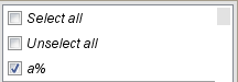
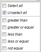
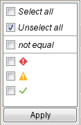
Bei den weiß unterlegten Feldern handelt es sich um so genannte Kann-Eingabefelder, für die nicht zwingend eine Eingabe erwartet wird. Für bestimmte Felder sind besondere Selektionsfunktionen möglich. Folgende Einträge sind in diesem Zusammenhang vorgesehen (alle Beispiele beziehen sich auf die vorige Abbildung der Anwendung KTO)
Die Tabelle teilt sich auf in einen festen Bereich und in einen verschiebbaren Bereich. Im verschiebbaren Bereich lassen sich per Drag+Drop Spalten in ihrer Reihenfolge verändern. Hierzu wird mit der Maus der Spaltenkopf angesteuert und mit gehaltener Maustaste an die gewünschte Stelle platziert.
Im verschiebbaren Bereich können einzelne Zellen selektiert werden. Der Mausklick in Verbindung mit der Strg-Taste ermöglicht die Selektion mehrerer einzelner Zellen. Komplette Tabellenzeilen werden nur bei Mausklick in den festen Bereich (Schlüssel) selektiert. Der Mausklick in Verbindung mit der Strg-Taste ermöglicht die Selektion mehrerer Zeilen.
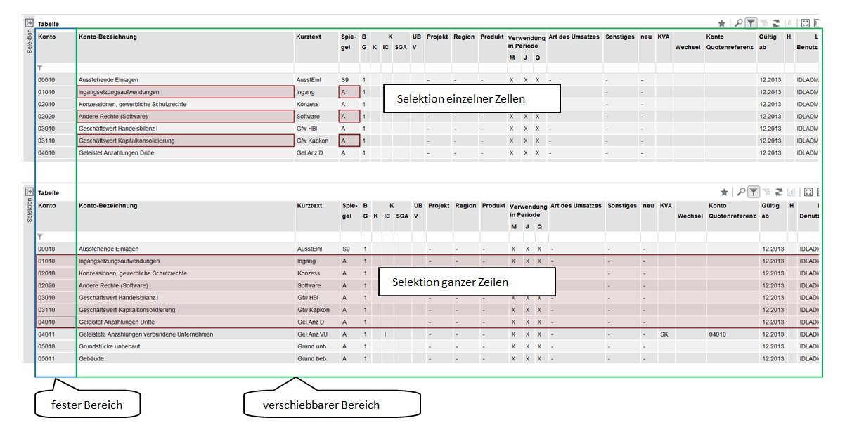
Abbildung: fester Bereich / verschiebbarer Bereich
In allen Übersichten können die angezeigten Daten nach beliebigen Spalten sortiert werden. Dazu enthalten die Spaltenüberschriften ein Sortiersymbol, das dann aufleuchtet, wenn der Mauszeiger auf eine Spaltenüberschrift zeigt. Durch einen Mausklick auf dieses Symbol wird die Tabelle aufsteigend nach dem Inhalt dieser Spalte sortiert. Ein erneuter Mausklick sortiert den Inhalt absteigend, ein dritter Mausklick schaltet die Sortierung wieder aus. Es können auch mehrere Spalten zur Sortierung ausgewählt werden. Die Sortierung nach der zweiten ausgewählten Spalte überlagert dann die Sortierung nach der ersten angewählten Spalte. Durch Betätigen des Buttons <Anzeigen> werden alle Sortierungen wieder ausgeschaltet. Die Sortierung erfolgt typgerecht, d.h. nummerische Spalten werden nach Höhe des Betrags, Datums- und Uhrzeitfelder in zeitlicher Reihenfolge sortiert. Ansonsten erfolgt die Sortierung alphabetisch. Die Sortierung wird durch Leerzeilen unterbrochen. So wird z.B. in der Übersicht "Kontensalden" (KTOSAL) der Abstimmblick mit den Summen der Aktiva, Passiva, Erträge und Aufwendungen nicht mit den Kontensalden vermischt, da Salden und Abstimmblock durch eine Leerzeile getrennt sind. Bei der Anzeige einer Tabelle in Baumstruktur werden die Knotenzeilen nicht umsortiert, sondern nur die Zeilen auf der untersten Ebene der Struktur innerhalb ihres Zweiges.
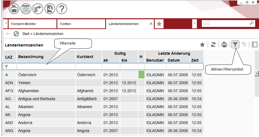
In einem Großteil der in IDL Konsis verwendeten Tabellen wird eine spaltenorientierte Filterung angeboten, die es erlaubt den Inhalt einer Tabelle über Filterparameter einzugrenzen, um entweder einen besseren Überblick über die Inhalte zu erlangen oder um Inhalte zu suchen.
Hierzu wird zwischen den Spaltenüberschriften und den Zelleninhalten der Tabelle eine zusätzliche Filterzeile eingefügt. Diese lässt sich durch das Filtersymbol ein- und ausschalten. Ein aktivierter Filter lässt sich daran erkennen, dass die Filterzeile angezeigt wird und das Filtersymbol mit einem Rahmen versehen ist.
Für jede Spalte kann in der Filterzeile ein eigener Filterparameter angegeben werden. Die einzelnen Zeilen der Tabelle werden nur noch dann angezeigt, wenn für jede Spalte die Filterangabe passt. So kann z.B. gleichzeitig über eine "Bezeichnungs"-Spalte eine fachliche und über die "Gültig ab" Spalte eine zeitliche Eingrenzung vorgenommen werden.
Werden in mehreren Spalten Filteranweisungen angegeben, werden nur genau die Zeilen angezeigt, die zu allen Filteranweisungen passen. Die Filteranweisungen bleiben auch bei Änderung der Selektionskriterien und erneuter Datenanzeige erhalten, so dass ggfs. keine Daten angezeigt werden, obwohl Daten aus der Datenbank gelesen wurden. Die Angabe der Anzahl selektierter Sätze in der Meldungszeile bezieht sich immer auf die gemäß der Selektionskriterien aus der Datenbank gelesenen Daten unabhängig von der Filterung.
Um die Filterparameter zu definieren gibt es zwei Möglichkeiten: Die einfache Variante ist die Verwendung des Filter-Assistenten. Die zweite Alternative besteht darin, direkt in die Filterzeile den Filterparameter einzugeben. Für bestimmte Zwecke ist dieses Verfahren schneller und erlaubt mehr Filterkonstrukte.
[Filterassistent]: Der Filter-Assistent kann durch Betätigung des Drop-Down-Knopfs in der Filterzeile aktiviert werden. Wird der Knopf betätigt, öffnet sich eine erweiterte Auswahlliste. Im oberen Abschnitt befinden sich allgemeine Auswahlkriterien, die abhängig vom Datentyp (Text, Wert oder Datum) der Spalte variieren. Im einfachsten Fall wird bei Textspalten eine Auswahl für alle (Alles auswählen) oder für keine (Nichts auswählen) Ausprägung angeboten. Im unteren Teilbereich sind die Ausprägungen aufgezählt, wie sie in der Spalte vorgefunden wurden. Sollte die Anzahl der Ausprägungen sehr hoch sein, dann werden automatisch Teilausdrucke mit gemeinsamen Anfangsbuchstaben gebildet. Alle Ausprägungen können einzeln angeklickt werden. Über "Alles auswählen" werden alle Ausprägungen angehakt.
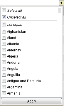
Wird bereits ein Filter angewendet, ist dieser ebenfalls im oberen Bereich mit eingetragen, so dass zurück zum alten Filter gewechselt werden kann.
Ist der Datentyp einer der Spalten Zahl, Datum oder Uhrzeit, werden zusätzlich Vergleichsoperatoren angeboten. Diese werden in Kombination mit einer Ausprägung angewendet. So kann z.B. ein Datum und größer als angeklickt werden, um zu erreichen, dass nur Zeilen mit einem späteren Datum angezeigt werden.
In Übersichtstabellen werden häufig Bilder für Statusanzeigen eingesetzt, wenn in den Darstellungsoptionen die Option "Icons statt Farben in der Tabelle" aktiviert ist. Diese grafische Darstellung wird auf den Filter-Assistent übertragen.
[Manuelle Filtereinstellungen]: Die Filterparameter können auch manuell in die Filterzeile eingetragen werden. Jede Spalte hat hierfür ein eigenes Eingabefeld. Für Spalten mit Textinhalten können einfache Teiltexte eingegeben werden. Zeilen werden immer dann angezeigt, wenn der Filtertext in der Spalte enthalten ist.
Wie in IDL Konsis üblich, können auch die Sonderzeichen % und _ angewendet werden. Wird das Prozentzeichen hinten an den Filtertext angehängt (z.B. 010% oder Sonst%), dann werden alle Einträge angezeigt, die mit dem Filtertext beginnen. Entsprechend sorgt das Prozentzeichen vorn am Filtertext (z.B. %05 oder %Maschinen) für eine Eingrenzung auf Tabelleninhalte, die mit dem Filtertext enden. Wird das Prozentzeichen sowohl vorn als auch hinten angehängt, verhält sich der Filter genauso wie ohne Prozentzeichen. Der Unterstrich wird im Filter eingesetzt, um einen Platzhalter für ein einzelnes Zeichen anzugeben (z.B. 0_010). Der Platzhalter kann beliebig gefüllt werden. Diese Einschränkung kann besonders effektiv bei Kontonummern verwendet werden.
Mit den Sonderzeichen "&", "|" "(" und ")" lassen sich mehrere Teilausdrücke für Zahlen- oder Zeitangaben verknüpfen. Wird "&" zwischen zwei oder mehr Ausdrücken verwendet, dann müssen alle Teilausdrücke erfüllt sein, damit eine Zeile nicht herausgefiltert wird. Bei "|" hingegen muss nur mindestens ein Teilausdruck erfüllt sein. Durch den Einsatz von runden Klammern lassen sich "&" und "|" kombinieren.
Sind in der Spalte Zahlenwerte enthalten (dazu gehören auch Periode, vollständige Datumsangaben oder Uhrzeiten), können mathematische Formeln für die Filterung angelegt werden. Mathematische Formeln verwenden die Vergleichsoperatoren "=" (gleich), ">" (größer als), ">=" (größer als oder gleich), "<" (kleiner als), "<=" (kleiner als oder gleich) sowie "<>" (ungleich). Einfache Anwendungsmöglichkeiten sind die Anzeige von Werten, die größer als ein angegebener Wert sind, z.B. durch ">1000", oder von Zeilen, die nach einem bestimmten Datum verändert wurden, z.B. durch ">1.1.2011".
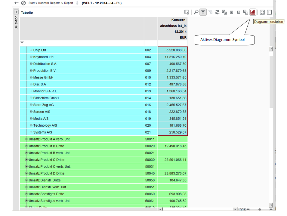
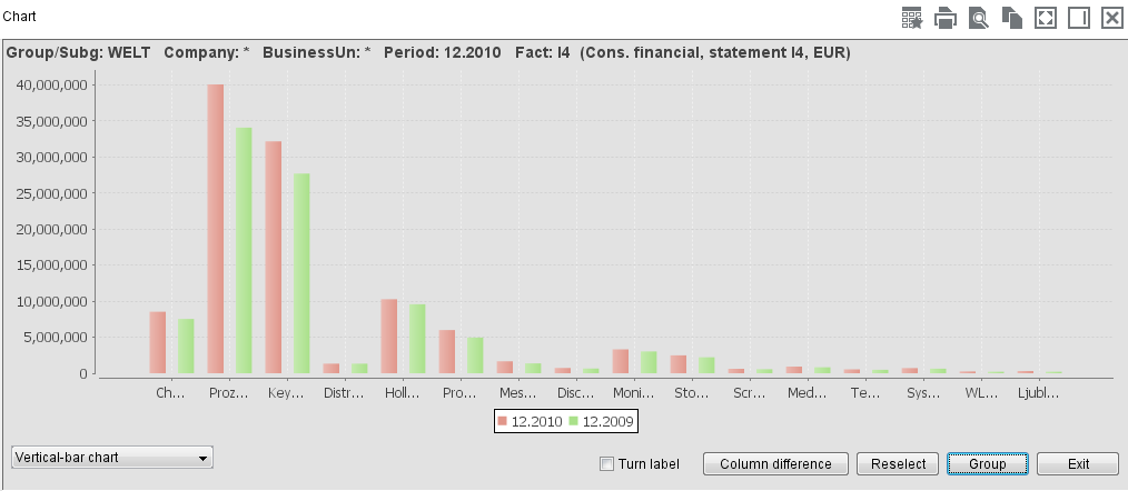
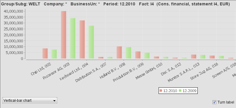
Alle in IDL Konsis angezeigten Werte können als Diagramm dargestellt werden. Dies gilt für alle Übersichten, Formularerfassungen und das IDL Forecast-Erfassungsformular. Diesem Zweck dient das Diagramm-Symbol in der Symbolleiste der Tabellenübersichten.
Werden Spalten mit nummerischen Daten markiert kann eine Diagrammanzeige ausgelöst werden. Das Diagramm wird in einem eigenen Bereich des Anwendungsfensters angezeigt. Sind mehrere Zeilen und Spalten markiert, werden mehrere Diagramme nebeneinander angezeigt. Je nach markierten Zellen werden die Diagramme und Säulen bzw. Tortenstücke mit den Daten der festen Spalten oder mit den Tabellenüberschriften betextet.
In Anwendungen, in denen Werte eingegeben werden können (z.B. Formularerfassung), aktualisieren sich die Diagramme automatisch, wenn sich die Werte geändert haben.
Es können beliebig viele Diagramme erzeugt werden, die als Registerkarten dieses Bereichs festgehalten werden. Die Diagramme bleiben auch bei Änderung der Schlüssel und neuer Datenselektion in der ursprünglichen Anwendung erhalten und zeigen die entsprechenden Schlüssel für die neuen Daten an, sofern diese Daten vorhanden sind. Beim Wechsel der Anwendung wird der Diagrammbereich allerdings geschlossen.
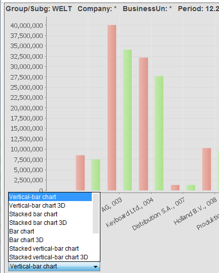
Über eine Auswahlbox im Diagrammbereich kann der gewünschte und für die verwendeten Daten sinnvollste Diagrammtyp ausgewählt werden. Im Optionsdialog "Allgemein" kann ein Standard-Diagrammtyp hinterlegt werden. Ist dort nichts eingestellt, wird i.d.R. das Säulendiagramm als Standard-Diagrammtyp verwendet.
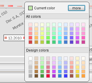
Die Farben des Balken-/Tortendiagramms können abgeändert werden. Dazu klickt man in den jeweiligen Eintrag in der Legende und ein Excel-ähnlicher Dialog zur Auswahl von Farben wird angezeigt. Durch die Selektion einer Farbe ändert sich automatisch die Farbe des Balkens bzw. des Tortenstücks im angezeigten Diagramm.
Der Anzeigebereich für die Diagramme enthält folgende Schaltflächen:
[Text drehen]: Längere Bezeichnungstexte können u.U. nicht vollständig dargestellt werden, wenn sie gerade unter den Diagrammen angezeigt werden. Das Aktivieren dieser Schaltfläche bewirkt ein Schrägstellen des Textes.
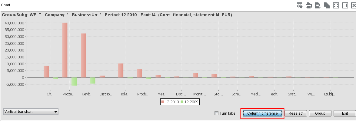
[Spaltendifferenzen]: Werden Daten für verschiedene Perioden markiert, z.B. aus einem Periodenreport heraus, kann über die Schaltfläche "Spaltendifferenzen" entschieden werden, ob diese kumuliert oder durch Subtraktion der einzelnen Spalten voneinander dekumuliert dargestellt werden sollen.
[Auswahl wiederherstellen]: Nach der Anzeige eines Diagramms können in der zugehörigen Übersicht andere Zellen markiert werden, z.B. um weitere Diagramme zu erzeugen. Mit dieser Schaltfläche kann die zu dem jeweiligen Diagramm zugehörige Selektion wiederhergestellt werden. Wenn die Übersichtstabelle nach Eingabe anderer Schlüssel neu aufgebaut wurde, wird diese Schaltfläche deaktiviert, da die Wiederherstellung der ursprünglichen Selektion nicht mehr möglich ist.
[Gruppieren]: Wirkt bei Diagrammen für Daten aus mehreren Zeilen und Spalten, so dass die Gruppierung der Daten nach Spalten bzw. nach Zeilen erfolgt. Zwischen den beiden Anzeigeformen kann beliebig hin und her geschaltet werden.
[Tabelle einblenden]: Diese über die Symbolleiste im Diagrammbereich aufzurufende Funktion ist sehr nützlich, um neben dem Diagramm auch die verwendete Tabelle sichtbar zu haben. Die Größe der beiden Bereiche lassen sich nach Bedarf mit Hilfe der Maus verändern. Im Tabellenbereich können einzelne Zeilen oder auch Spalten gelöscht oder auch zusammengefasst werden. Die Veränderungen werden sofort im Diagramm sichtbar.
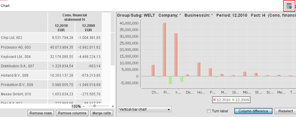
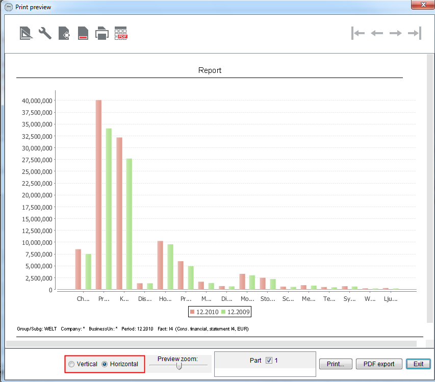
Diagramme können auf zwei Arten gedruckt werden: Wird die gesamte Übersicht ausgedruckt, werden die hierzu erstellten Diagramme nach der Tabelle in den Ausdruck übernommen. Über die kleine Symbolleiste oben rechts im Diagrammbereich kann das Diagramm auch direkt gedruckt werden. Hier wird lediglich immer genau das ausgewählte Diagramm ohne Tabelle gedruckt. Diagramme können in der Druckausgabe wahlweise gekippt werden. D.h. es kann gesteuert werden, ob eine Seite mit einem Diagramm horizontal oder vertikal gedruckt wird. Dies betrifft aber nur das Diagramm selbst, Kopf- und Fußzeilen sind davon nicht betroffen. Um den Druck eines Diagramms zu kippen, müssen Sie in der Druckvorschau bis zu der Seite blättern, auf der das Diagramm dargestellt ist. Dort erscheinen dann zusätzliche Optionsfelder zur Ausrichtung des jeweiligen Diagramms.
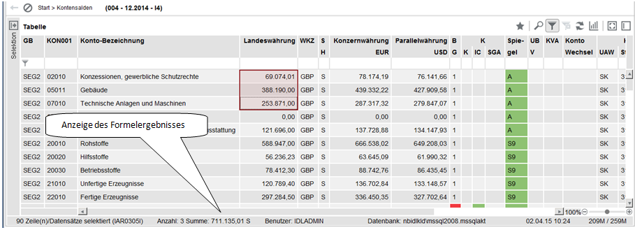
Mit Hilfe des aktivierten Zellenmodus (s.o.) kann auch eine Funktion zur Summenbildung genutzt werden. Die Werte aller markierten Zellen mit nummerischem Inhalt werden summiert und die Summe wird in einem neuen Feld in der Fußzeile angezeigt. Werte mit unterschiedlichen Soll-/Haben-Kennzeichen werden subtrahiert, das Soll-/Haben-Kennzeichen der Summe wird neben dem Wert angezeigt.
Diese Funktion ist ein anwendungsunabhängiges Merkmal der Benutzeroberfläche. So werden z.B. bei entsprechender Selektion auch Werte in unterschiedlichen Währungen saldiert.
Ein weiterer Anwendungstyp ist der Einzelsatz (siehe Beispiel für den Kontenstamm KTOE unten)
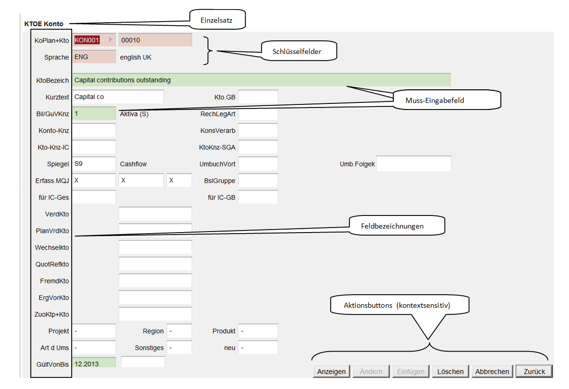
Im Einzelsatz sind Muss- und Kannfelder zu unterscheiden. Mussfelder sind grün hinterlegt, Kann-Eingabefelder sind weiß. Sofern die Muss-Eingabefelder nicht mit gültigen Eingaben gefüllt sind, wird der betreffende Datensatz nicht gespeichert. In diesen Feldern ist, wenn gewünscht, auf die Groß- und Kleinschreibung zu achten.
Erst innerhalb jeden Einzelsatzes wird entschieden, welche Aktion mit den vorher ausgewählten, geänderten oder neu eingegebenen Daten durchgeführt werden soll. Aktionsbuttons, die im aktuellen Kontext keinen Sinn ergeben, werden deaktiviert. So wird z.B. der [Button <Einfügen>] nur dann aktiv, wenn ein Schlüsselfeld geändert oder ein Einzelsatz komplett neu erfasst wurde. Der [Button <Ändern>] wird erst nach Änderung eines Attributfeldes verwendbar. Nur die [Buttons <Abbrechen>] und [<Weiter>] sind immer aktiv. Einer der angezeigten Buttons ist der [Default-Button], der auch durch die [<Enter>-Taste] ausgelöst werden kann, erkennbar an der dickeren Umrahmung. Es wird kontextsensitiv der Button als Default-Button gekennzeichnet, der aufgrund der erfolgten Eingaben am wahrscheinlichsten gewählt werden soll. Nach erfolgter Änderung ist dies z.B. der Button <Weiter>, um die nächste markierte Zeile zu bearbeiten. Nach Bearbeitung der letzten in der Übersicht markierten Zeile wechselt der Text des <Weiter>-Buttons auf <Ende>. Die Betätigung von <Ende> führt zurück in die Übersicht, wobei die angezeigte Tabelle automatisch aktualisiert wird. Im Gegensatz dazu bricht der Button <Abbrechen> die Verarbeitungsfolge ab und kehrt in die Übersicht zurück, ohne dass die Tabelle aktualisiert wird.
Hilfetexte sind über Aktions-Aufrufe für jeden Datensatz erstell- und anzeigbar. Im unteren Teil des Einzelsatzes wird vermerkt, welcher Anwender zu welchem Zeitpunkt einen benutzerverursachten Hilfetext eingegeben hat. Mehr zum Thema Hilfetexte zu Einzeldaten siehe auch das nachfolgende Kapitel Hilfetexte in dieser Dokumentation.
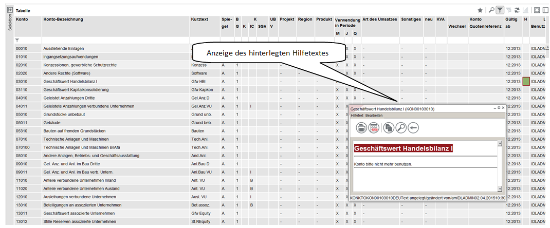
In IDL Konsis ist es möglich, individuelle Hilfetexte zu allen Stammdaten (z.B. Konten) und Berichtsdaten (z.B. Kontensalden) zu erfassen. Hierzu wird der vorhandene Datensatz markiert und das Aktionsmenü "Hilfetext editieren" ausgewählt. Ist ein Hilfetext erfasst worden, wird im Einzelsatz angezeigt, wann und von wem ein Hilfetext zuletzt geändert wurde. In den Übersichten wird die Existenz von Hilfetexten durch eine zusätzliche Spalte mit der Überschrift "H" angezeigt. In dieser Spalte wird durch eine grüne Farbfläche oder einen grünen Haken angezeigt, wenn es zu dem in dieser Zeile angezeigten Objekt einen Hilfetext gibt. Die Anzeige dieser Spalte kann im Menü <Ansicht> aktiviert bzw. deaktiviert werden.
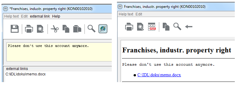
Zusätzlich können Sie Links einfügen, die auf externe Dokumente (z.B. Rechnungen oder Kalkulationen im Excel- Word oder pdf-Format), die zu einem Datensatz gehören, verweisen. Hierfür stehen Ihnen im Hilfetext-Editor sowohl ein Menü als auch ein Symbol <externer Link> zur Verfügung. Bei <Link hinzufügen> öffnet ein Dateidialog, in dem die Datei, auf die ein Verweis erstellt werden soll, ausgewählt werden kann. Alternativ können Dateien auch von anderen Teilen der Benutzer-Oberfläche (z.B. aus einem geöffneten Windows-Explorer) mit der Maus in das Hilfetext-Editor-Fenster gezogen und dort fallen gelassen werden. Die gewählte(n) Datei(en) werden dann im Fußteil des Editor-Fensters unter der Überschrift "externe Verknüpfungen" angezeigt. Mit <Link löschen> oder der Entfernen-Taste kann der Link wieder entfernt werden, wenn er zuvor markiert wurde. In der Hilfetext-Anzeige wird die Liste mit den Verweisen auf Dateien ebenfalls im Anschluss an den Hilfetext ausgegeben. Bei Mausklick auf den Verweis wird versucht, das Dokument mit der passenden Anwendung zu öffnen.
Wichtig für diese Anwendung ist, dass die Dokumente, auf die verwiesen wird, für alle IDL Konsis-Benutzer verfügbar sind. Die Dokumente sollten also nicht auf lokalen Laufwerken stehen, sondern nur auf Server-Laufwerken, die allen Benutzern mit derselben Laufwerks-Kennung zur Verfügung stehen.
Neben dem Menüaufbau ist auch die Anzeige folgender Übersichten in Baumdarstellung möglich:
Das Auf- und Zuklappen einzelner Zeilen erfolgt analog zum Menübaum. Zusätzlich ist dies auch über die Symbolleiste möglich. Darüber hinaus ist auch ein Navigieren mit der Tastatur möglich. Die Pfeiltasten (rechts/links) sowie die "+" und die "-" Taste des Ziffernblocks können zur Steuerung von Baumstrukturen verwendet werden.
IDL Konsis kann auch in anderen Sprachen als in Deutsch genutzt werden. Hierbei sind zwei Möglichkeiten zu unterscheiden:
Wie in Abschnitt 1.2.Globale Menü-Zeile beschrieben, können über den Menüpunkt <Extras -> Optionen> Einstellungen bzgl. der Sprache vorgenommen werden. Diese Einstellung bezieht sich ausschließlich auf die Programmoberfläche und wird erst nach erneutem Start von IDL Konsis wirksam. Die hier auswählbaren Sprachen werden von IDL gepflegt und können nur mit einer entsprechenden Lizenz ausgewählt werden. Derzeit werden neben Deutsch auch Englisch, Französisch und Spanisch unterstützt.
Stammdaten, wie z.B. Konten- oder Positionsbezeichnungen, können in mehreren Sprachen gepflegt werden. Diese Sprachen können, anders als die Oberflächensprachen, kundenseitig individuell in der Anwendung <SPR> gepflegt werden. In welcher Sprache die Stammdaten standardmäßig angezeigt werden sollen, kann je Benutzer in der Anwendung <USE> und <VOR> eingestellt werden. Erfolgt nur hier eine Änderung der Sprache von Deutsch auf z.B. Englisch, werden die Menüpunkte weiter auf Deutsch angezeigt, nur in den Stammdatenübersichten erfolgt die Anzeige auf Englisch. Eine Änderung an dieser Stelle wird sofort wirksam.